ArcGIS Pro 3.5 was released last week. In this post, I want to discuss the features of ArcGIS Pro I admire the most as well as highlight a few of the many updates found in this release.
If you're unfamiliar with the history of ArcGIS Pro, please see my Spatial Data Science MOOC review post.
My Workstation
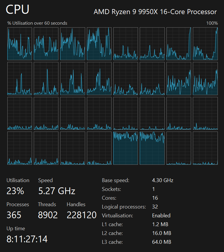
I'm using a 5.7 GHz AMD Ryzen 9 9950X CPU. It has 16 cores and 32 threads and 1.2 MB of L1, 16 MB of L2 and 64 MB of L3 cache. It has a liquid cooler attached and is housed in a spacious, full-sized Cooler Master HAF 700 computer case.
The system has 96 GB of DDR5 RAM clocked at 4,800 MT/s and a 5th-generation, Crucial T700 4 TB NVMe M.2 SSD which can read at speeds up to 12,400 MB/s. There is a heatsink on the SSD to help keep its temperature down. This is my system's C drive.
The system is powered by a 1,200-watt, fully modular Corsair Power Supply and is sat on an ASRock X870E Nova 90 Motherboard.
I'm running Ubuntu 24 LTS via Microsoft's Ubuntu for Windows on Windows 11 Pro. In case you're wondering why I don't run a Linux-based desktop as my primary work environment, I'm still using an Nvidia GTX 1080 GPU which has better driver support on Windows and ArcGIS Pro only supports Windows natively.
Installation Footprint
ArcGIS Pro takes up 6.3 GB of space when installed. There are 786 DLLs in its binary folder.
Among these is GDAL version 3.10.2 which was published on February 14th.
For the first time, DuckDB now ships and version 1.2.1 from March 5th is included.
There are 313 MB worth of AI models packaged in GGUF format and 270 MB of JAR files for several Hadoop ecosystem packages.
Python Ergonomics
Python has been upgraded to version 3.11.11 which was originally published on December 3rd. Esri have also bundled almost 300 3rd-party Python libraries as well.
If you haven't worked with Python interactively in ArcGIS Pro, the REPL behaves much like iPython does in a Terminal. Multi-line statements are easy to write, execute and recall through the REPL's history. There is also syntax highlighting which makes the transcript of commands easier to read.
Most tasks allow you to generate corresponding Python code from the UI. This can help both document workflows as well as automate larger jobs. For example, in the bottom right of the screen shot below, there is a "Copy Python Code" button.
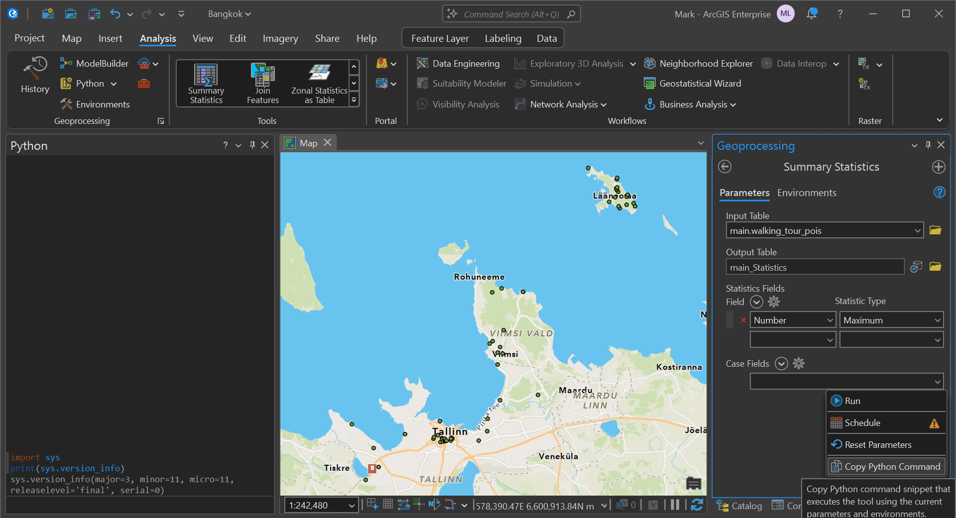
Below is the code it generated.
arcpy.analysis.Statistics(
    in_table="main.walking_tour_pois",
    out_table=r"C:\Users\markl\Documents\ArcGIS\Projects\Tallinn\Tallinn.gdb\main_Statistics",
    statistics_fields="Number MAX",
    case_field=None,
    concatenation_separator=""
)
Is is now a debugging extension that integrates ArcGIS Pro with Microsoft's VS Code. This includes functionality for remote debugging over SSH as well.
Parquet Support
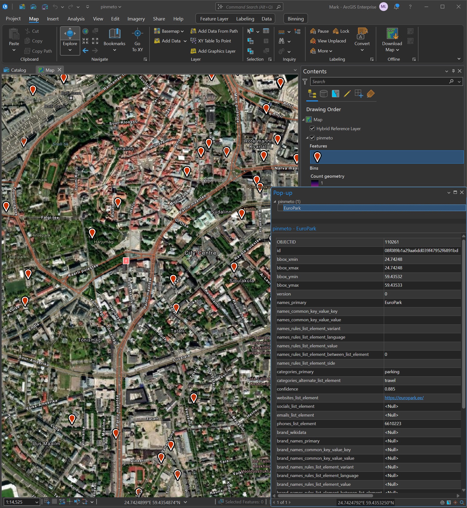
Parquet files can be dropped into a scene now. Below I've added Parquet data for Downtown Calgary from Overture's Building dataset.
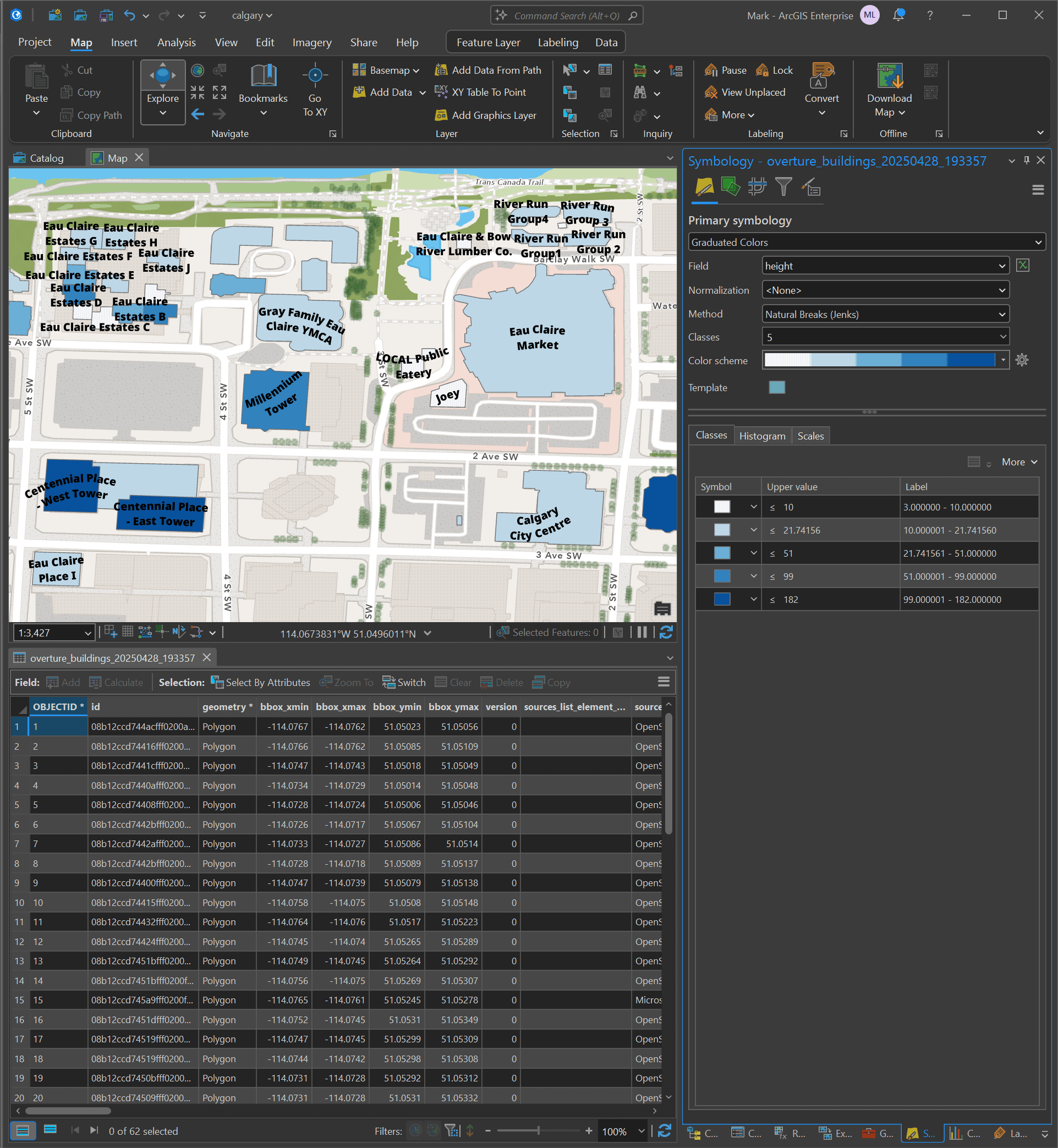
I dropped a 1.5 GB Overture Parquet file onto a map and it only took about a minute to generate a cache before appearing. ArcGIS Pro is surprisingly performant with this amount of data on display.
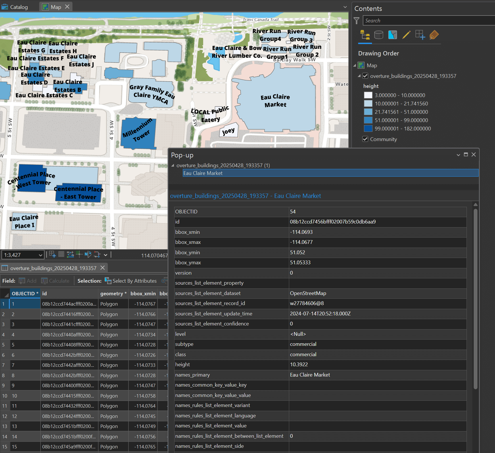
When a field is a list of dictionaries, such as the names field in the Overture Buildings dataset below, ArcGIS Pro will denormalise these fields so they're easier to work with.
GeoPackage (GPKG) files still need to be imported via the Map Ribbon's "Add Data" dialog as there can be more than one feature layer in any GPKG file.
If you haven't worked with Parquet data before, I wrote a short walk-through on building a 15.8M-address Parquet file for Canada. I also published a walk-through of using Parquet to catalog 7M satellite images from Satellogic and I wrote a review of Overture Maps' ~450 GB global dataset that is refreshed on a monthly basis.
Automatic Heatmaps
When you drop a Parquet file with a lot of records onto a map, a heatmap will be generated automatically. This makes it easy to find hotspots and clusters.
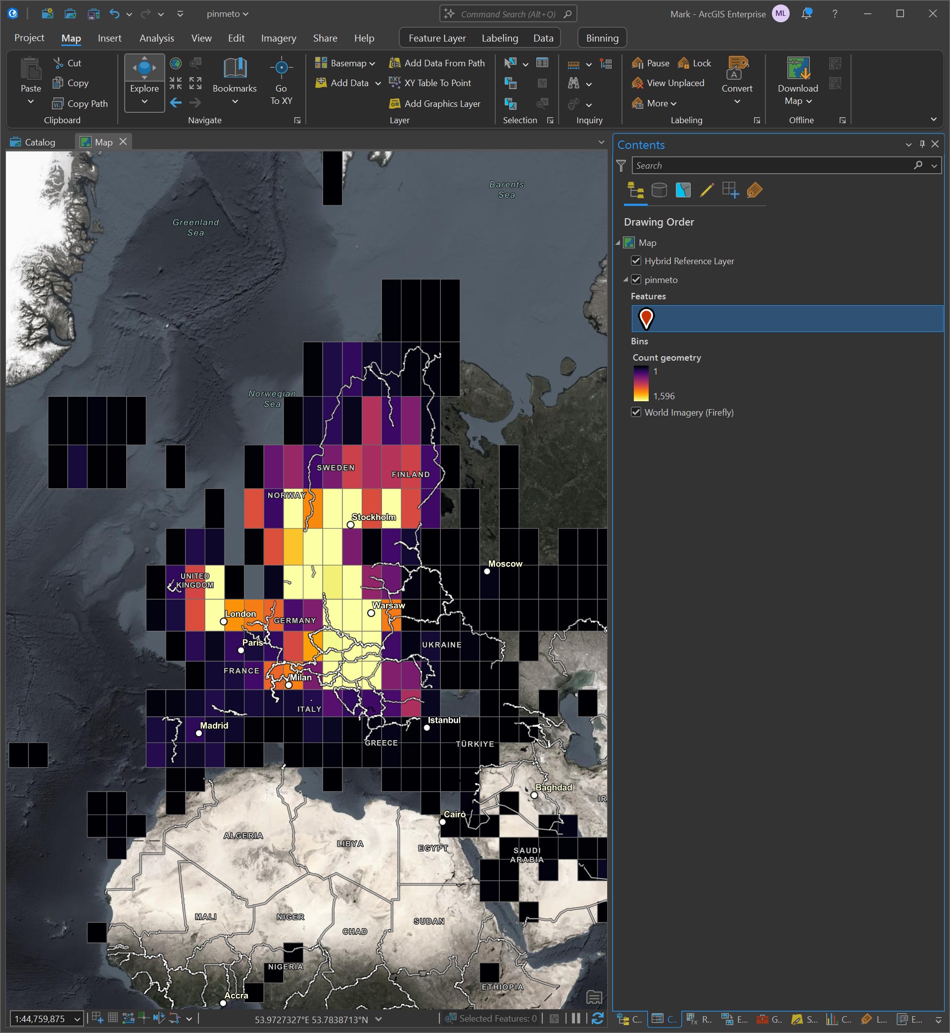
As you zoom in, the bins will become more granular.
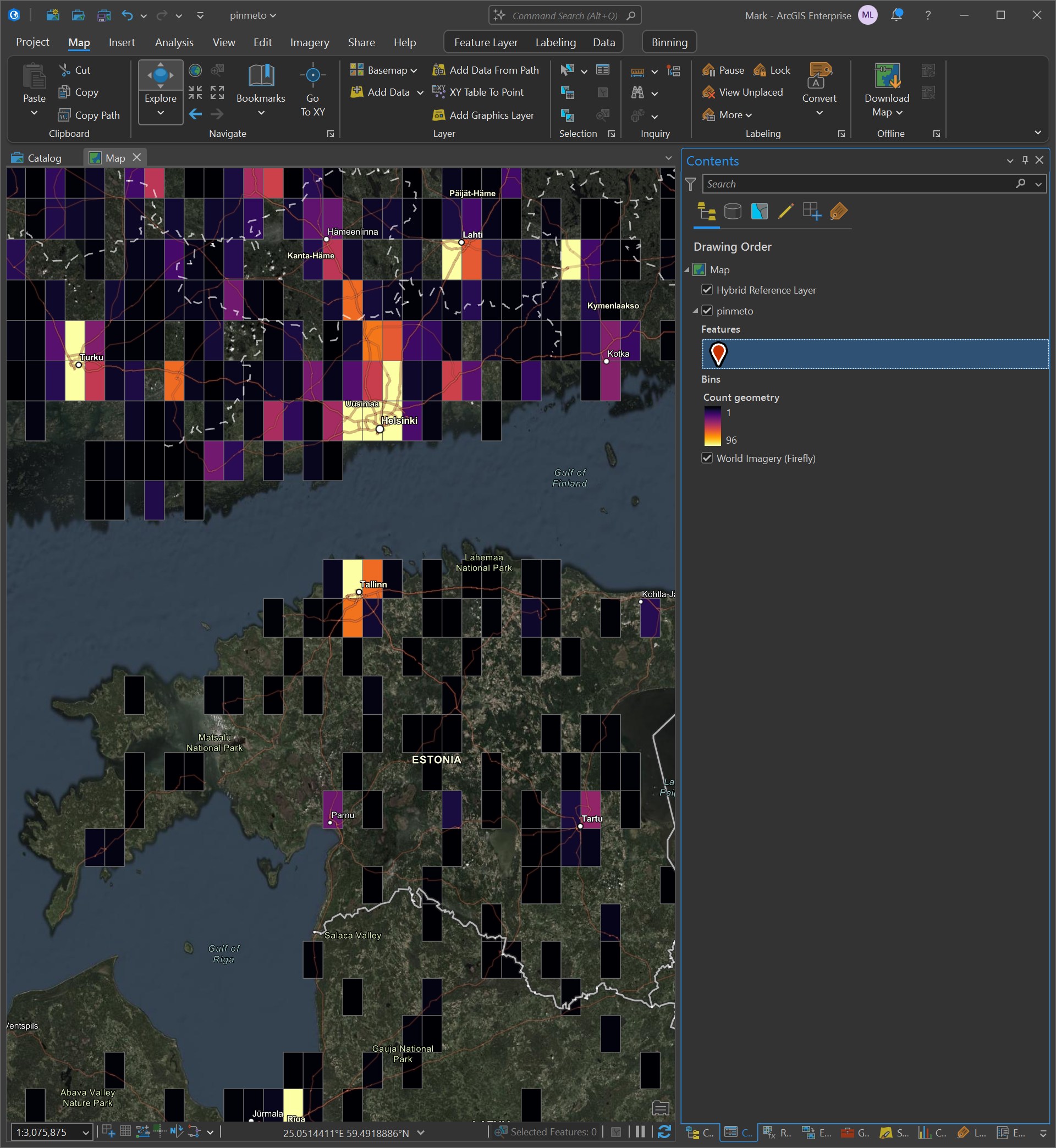
Finally, when you zoomed in close enough, the individual pieces of geometry will appear. In this case, they're points.
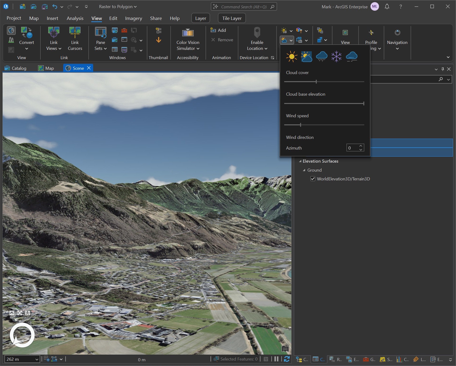
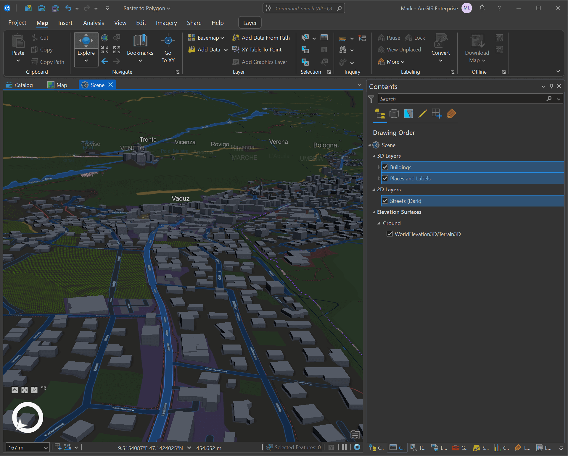
Clouds in 3D
There is now a sky box, clouds and weather effects in the 3D scene viewer. Below is an example from Liechtenstein.
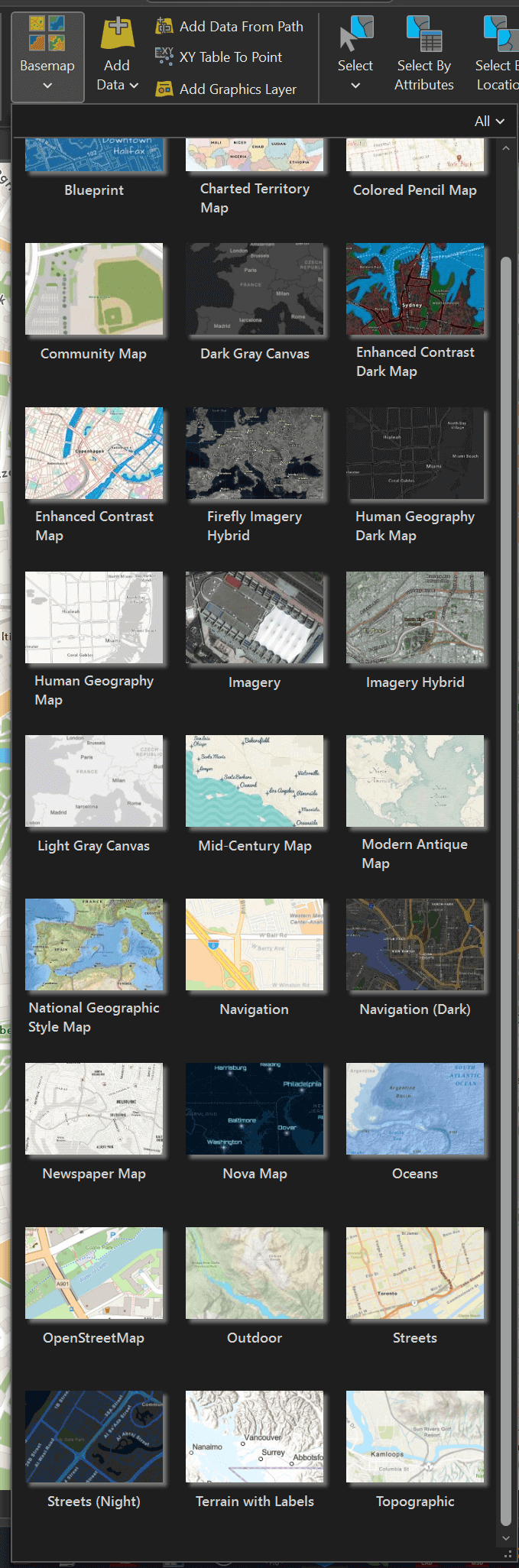
This hasn't changed since the previous release but there are different options for 2D and 3D basemaps. Below are the 2D basemaps.
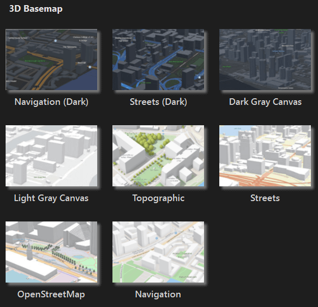
And if you're in a 3D scene, the following 3D basemaps are available.
Below is an example that includes simple 3D buildings.
On the 2D side, OpenStreetMap's basemap is vector-based. There is a good density of labels at every zoom level and they're easy to read.
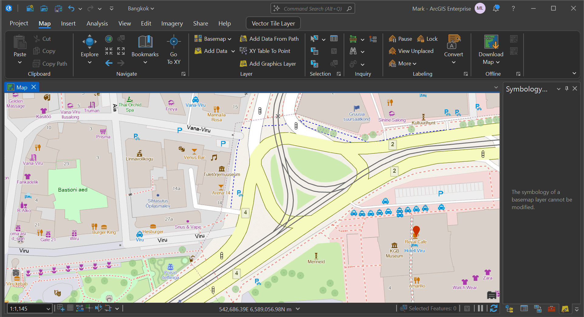
I haven't found a way to set the language of the labels so they'll default to the area's dominant language. Above you can see several POIs have Estonian language labels.
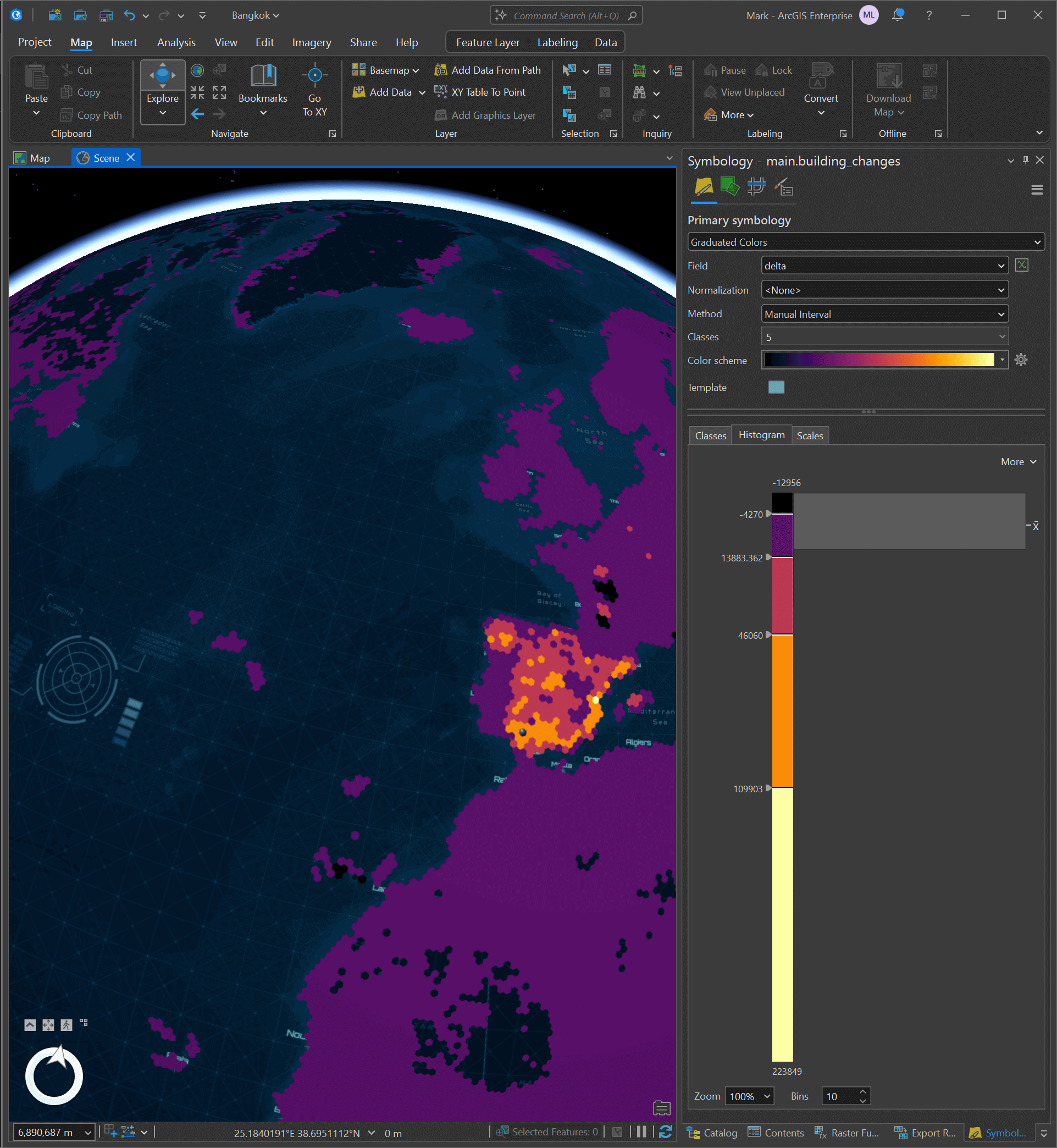
Histogram Ergonomics
You can fine-tune heatmap gradient thresholds in ArcGIS Pro 3.5 now. As you adjust ranges the map updates in real time.
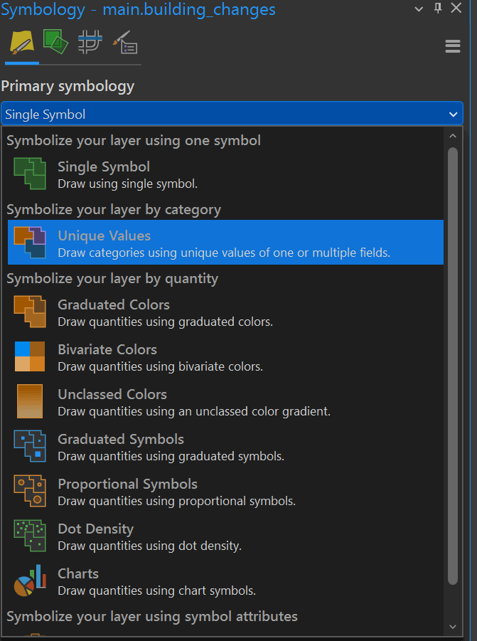
Select "Graduated Colors" for any given layer's symbology.
And in the histogram section, you can manually adjust the thresholds for each class.
Better SAR Support
You can now specify imagery as being a "SAR" image. Below is an example with one of Umbra's images of Prince Rupert in Canada.
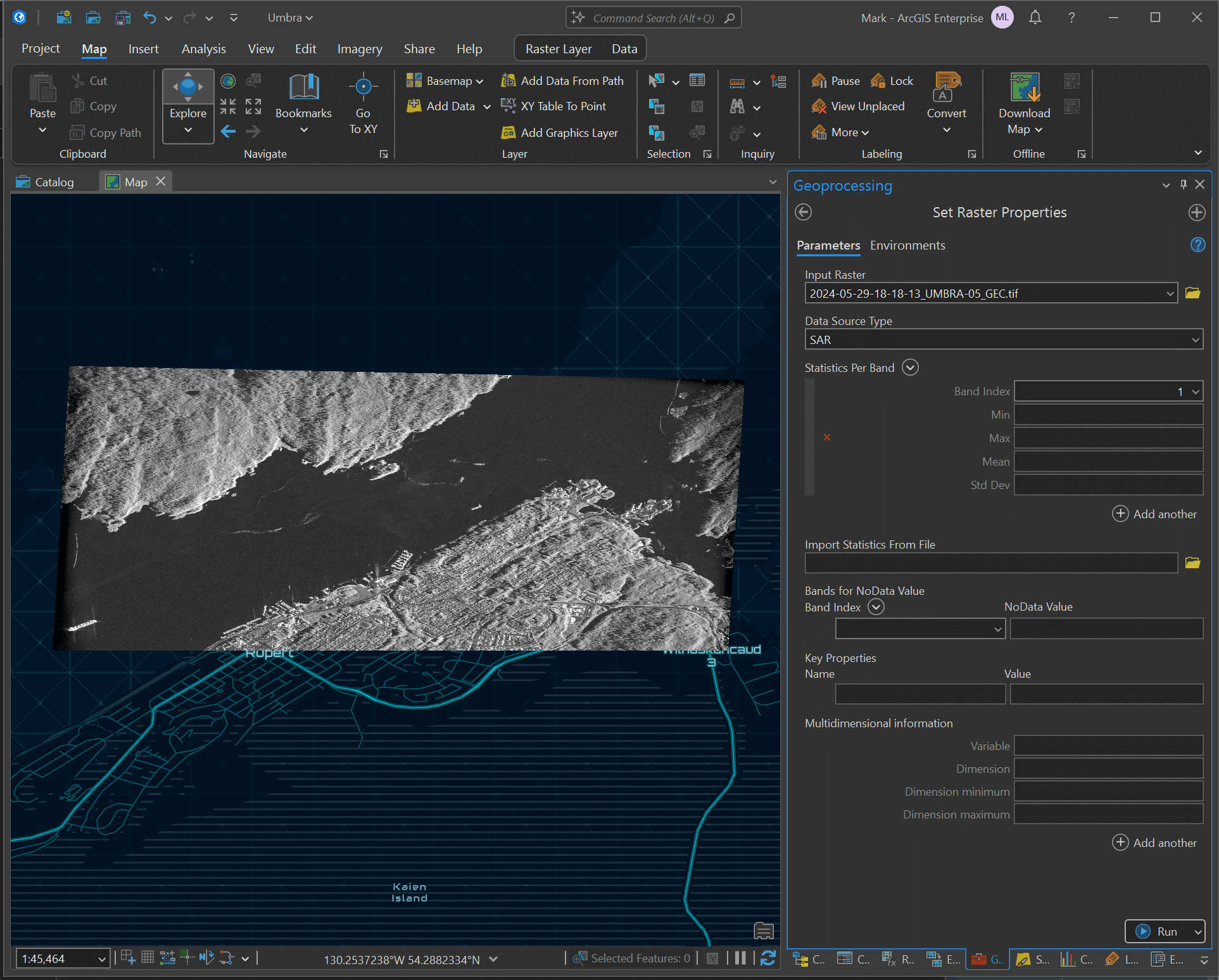
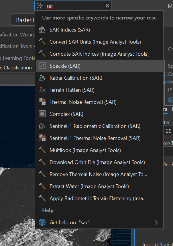
Once set, you can search for "SAR" in the top search bar and get a list of SAR-specific functionality that can be run on your imagery. The following functions are available even without the Imagery extension installed.
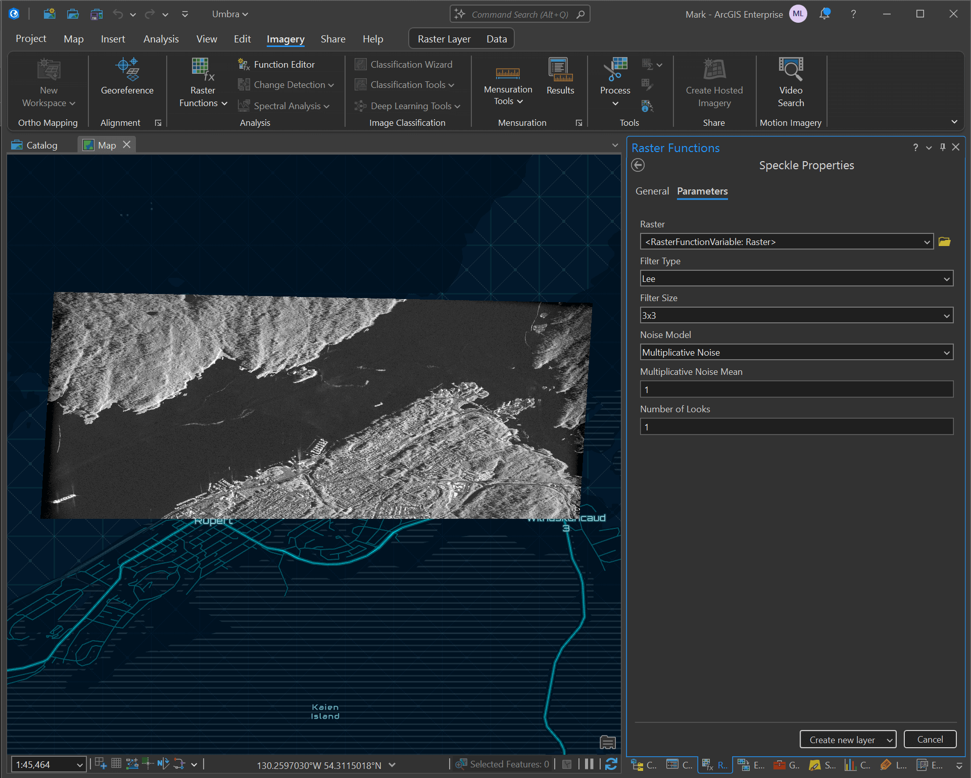
Below is a speckle remover.
I previously covered the thousands of freely available SAR images Umbra have made available via their open feed as well as a walk-through of detecting aircraft in their Bangkok Airport imagery.
Vector-based PDFs
Dual scale bars are now supported when putting pages together. This can allow measuring in both miles and kilometres.
Two years ago, I put together a travel guide for Estonia using mostly QGIS and Microsoft Word.
QGIS has a number of issues exporting vector-based page layouts to SVG due to underlying bugs in QT5. It's possible many of these issues could be resolved with QGIS' migration to QT6 later this autumn.
If I were to refresh this guide, I'd most likely just use ArcGIS Pro instead.
If you create a map, you can add a layout for any size of paper you wish.
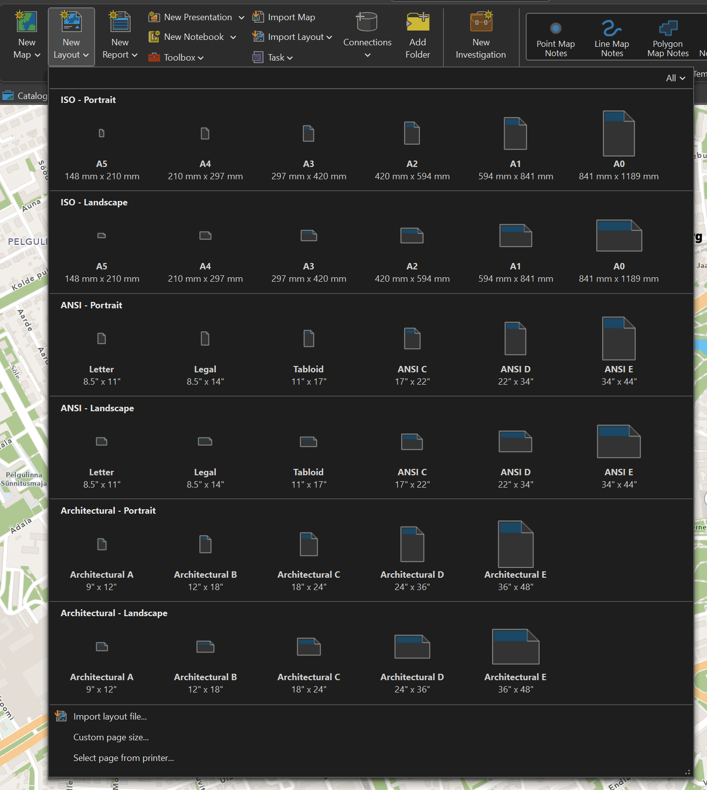
There are a large number of elements that can be added to the page layout with just a click of a button. It's as easy to layout and adjust page elements as it would be in Microsoft Office or any Adobe offering.
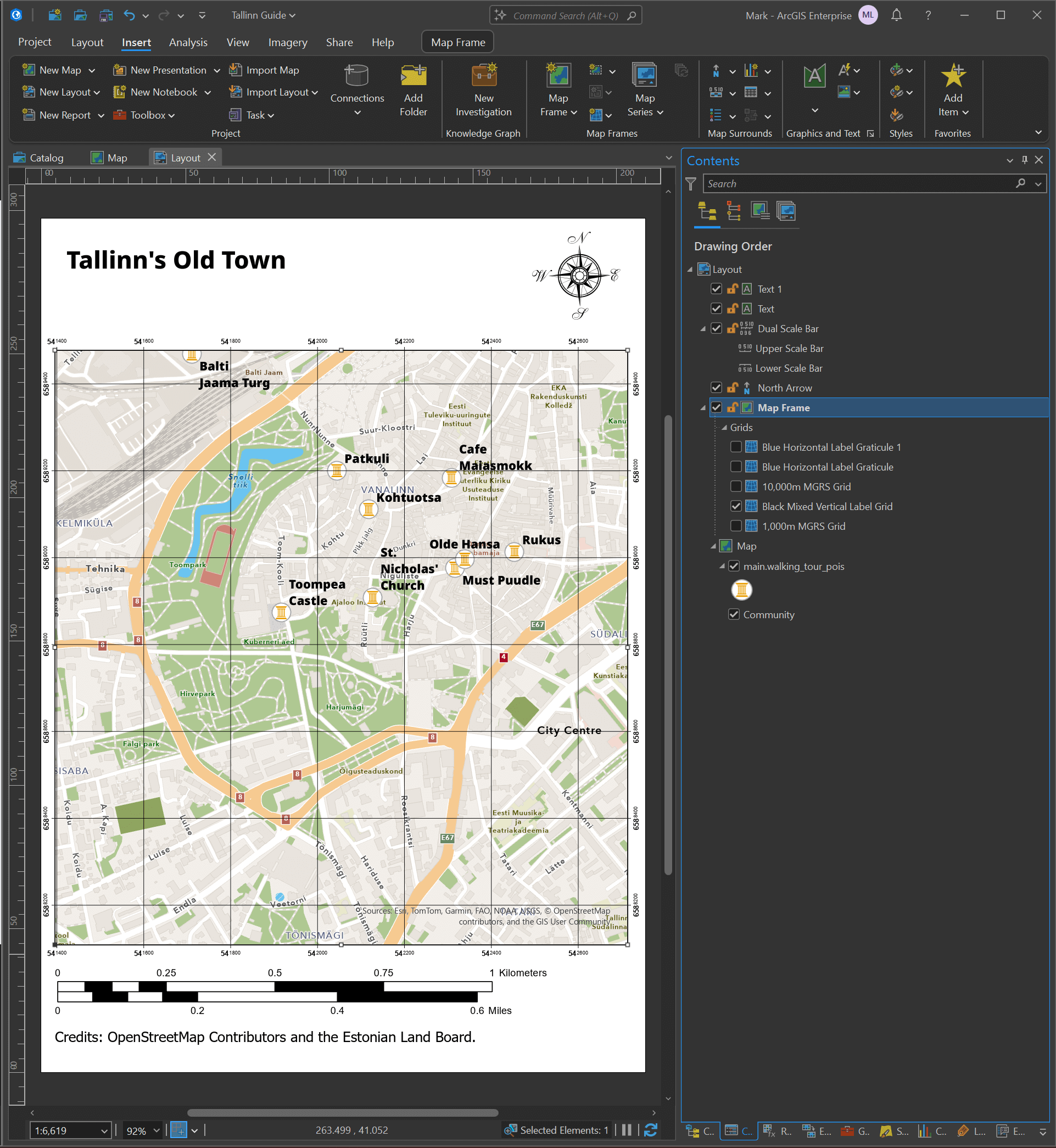
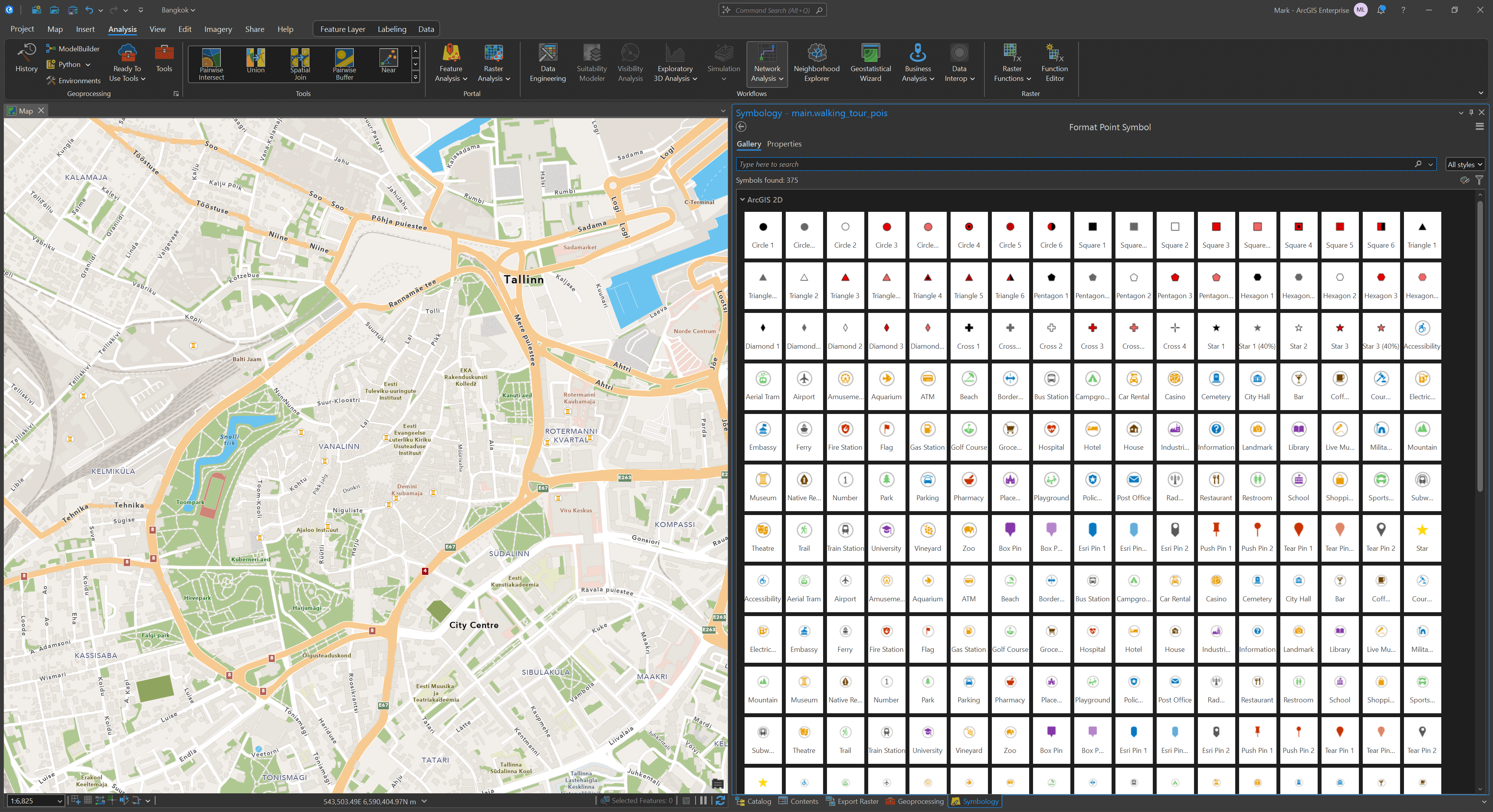
When putting the map together, there are a wide variety of high-quality symbols built into ArcGIS Pro as well.
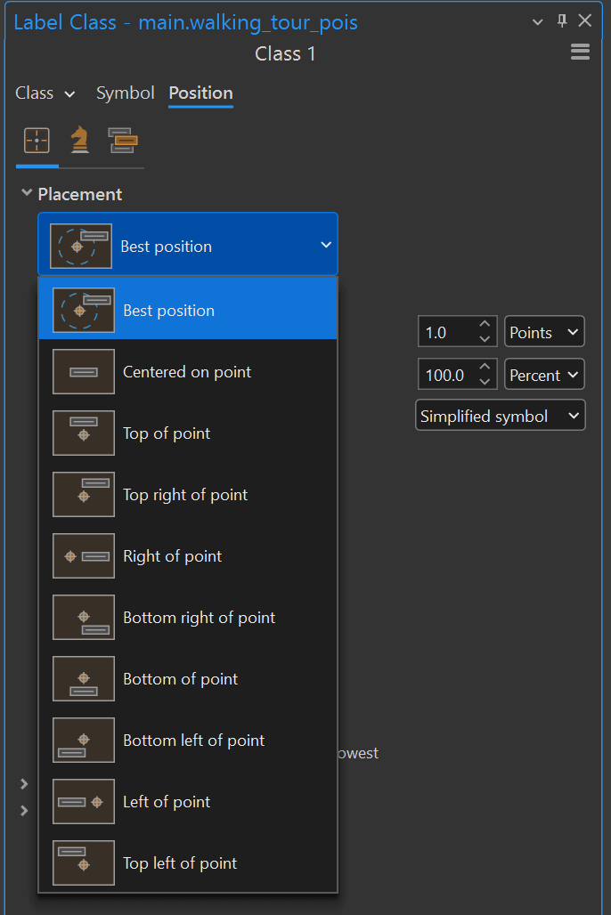
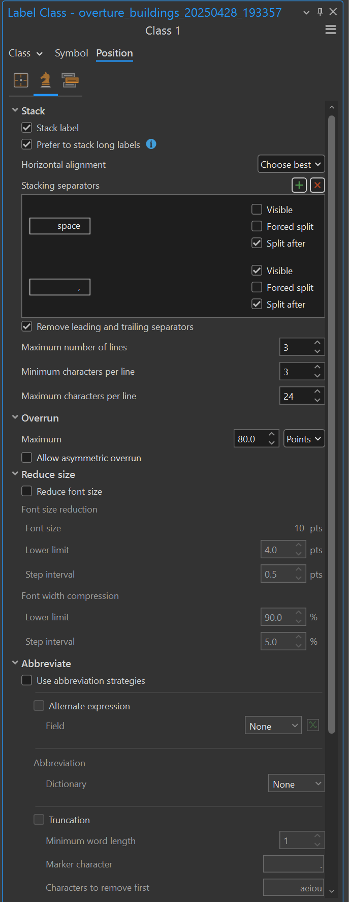
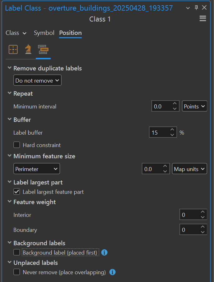
Label Engine
The Maplex Label Engine has been updated. When a label does not fit in a space, you can now split it into two or more parts and place each part on a new line to reduce its horizontal length.
In Esri's Cartography MOOC, week four is dedicated to learning how to tackle their approach to label placement. Their New York City exercise is excellent. I recommend anyone interested in map making to consider taking this free course.
The cartographers I admire the most use Adobe Illustrator and hand-place their labels but in office environments working on internal projects, ArcGIS Pro's label engine has always given me great results quickly without needing to search for work-arounds.
Below are some of the settings panes for the label engine.
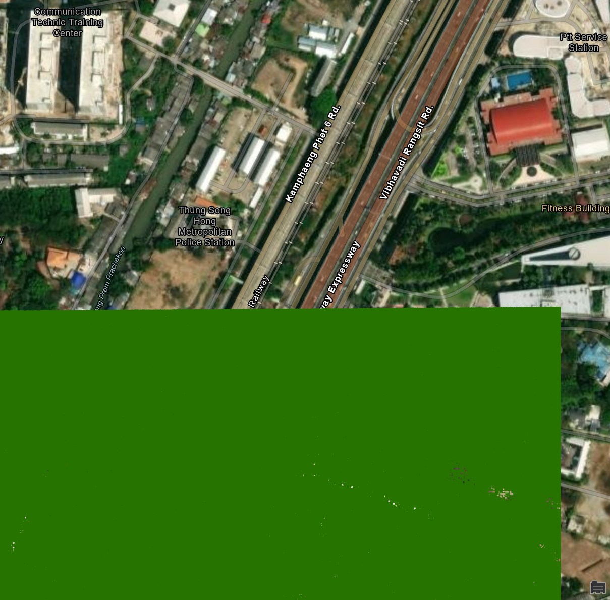
Raster to Polygon
ArcGIS Pro has had support for Deep Learning for a while now and I covered building footprint detection in satellite imagery in my review of Esri's Spatial Data Science MOOC. I wanted to see if the Raster to Polygon functionality in 3.5 was in any way a replacement for this.
I used one of Maxar's satellite images of Bangkok that was taken on February 14th.
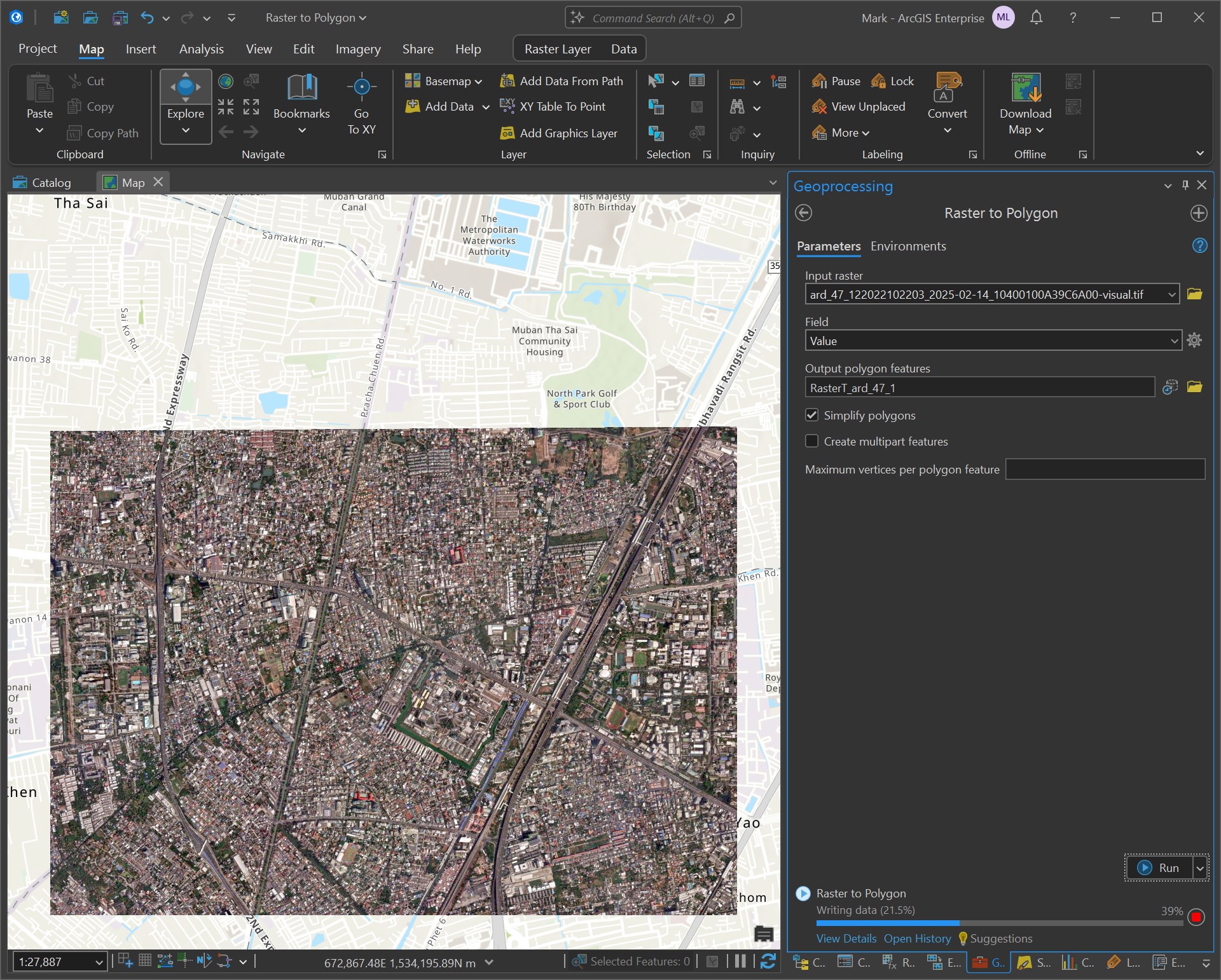
The Raster to Polygon process took three hours to run. During that time my CPU was busy but not maxed out.
When I zoom in to the resulting polygons, I can almost see outlines of buildings but each building is made up of 10s or 100s of almost random polygons.
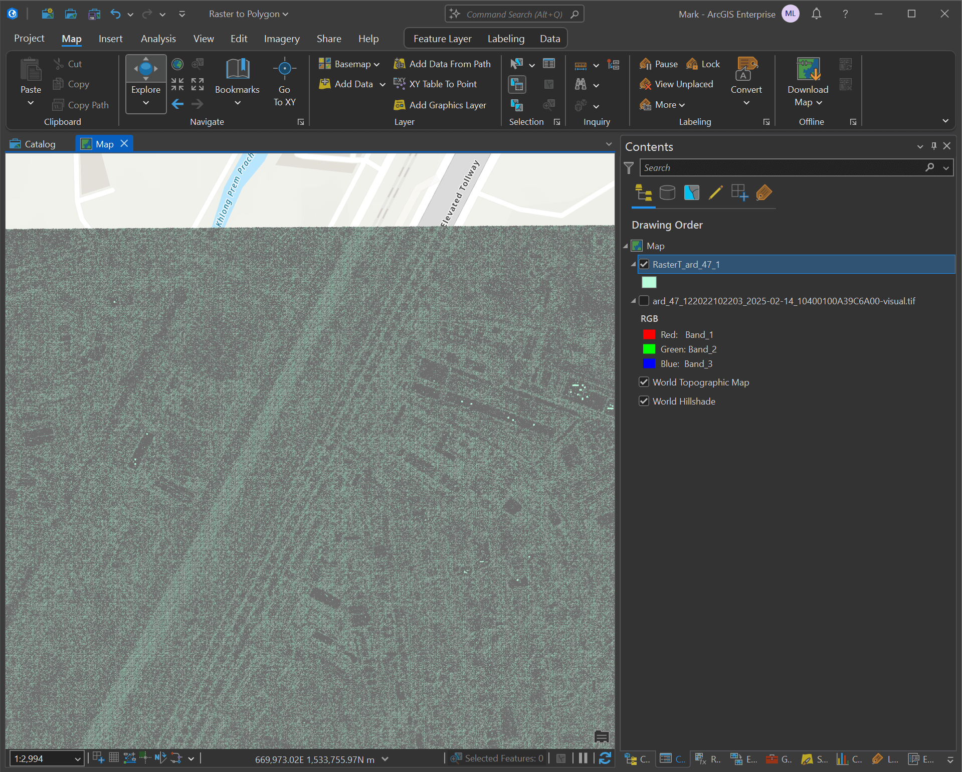
Here I've zoomed in to a section with a satellite image in the background for reference and the polygons are so small, they almost appear as a single green box.