In the 1960s, the Canadian Government employed Dr. Roger F. Tomlinson, a fellow dual British-Canadian citizen, to build a land planning system. He ended up both coining the phrase and producing the first computerised Geographic Information System (GIS).
Towards the end of the 1960s, Jack Dangermond, along with his wife Laura, founded a GIS consulting firm called Environmental Systems Research Institute (Esri). By the early 1980s, they'd produced and released Arc/Info, a publicly available piece of software that could create, manage and analyse maps. This software combined relational databases, computer graphics and spatial modelling, all of which were in their infancy and very much at the cutting edge at the time. This video from 1988 shows version 4 of the software.
By the end of the 1990s, the Arc/Info codebase was largely frozen and ArcGIS 8.0 was released. This was a software suite designed around common desktop design standards found at the time in Microsoft Windows. 2015 saw a major overhaul with the release of ArcGIS Pro which is the flagship offering Esri ship to this day.
Jack Dangermond and Roger Tomlinson were close and Roger helped out Esri a lot throughout the years. Esri have an annual conference attended by 10s of thousands. When Roger passed away in 2014, Jack wrote in a eulogy that Roger's favourite day of the year was giving out Special Achievement in GIS awards at the conference.
I've covered a number of minimalist GIS tools but ArcGIS Pro is the complete opposite. It has a vast feature list. Even the 1M+ lines of C++ that make up QGIS only amount to an installation footprint half of that of ArcGIS Pro's. QGIS' installation folder contains 135 DLLs on Windows 10, ArcGIS Pro has 734. This doesn't even include the dozens of other sibling software packages like Esri's Drone2Map offering.
GPU and AVX512 support come out of the box with ArcGIS Pro and the interface resembles Microsoft Office as it uses common UI behaviours and organisation systems found in many of Microsoft's offerings.
When you buy an ArcGIS Pro license, you get access to their Living Atlas offering. It contains 10K+ datasets that can be imported into ArcGIS Pro without any coding or other ETL work. I've spent much of the past few years collecting GIS data from 100s of sources for my clients to analyse, enrich and use to model their client's problems. Living Atlas saves a huge amount of data engineering work.
I usually discuss mixing multiple open source tools together to produce a deliverable but Esri have set out to create a one-stop-shop. An ArcGIS Pro user might not have many other applications running on their system simply because they have a single interface to get their work done.
Earlier this year, I purchased a license for ArcGIS Pro and set about training myself in using the software. There is a large library of YouTube tutorials that Esri produced and published as well as a decent online community making their own video tutorials. Esri run a handful of massive open online courses (MOOCs) and this week, I completed their 6-week Spatial Data Science course.
In this blog post, I'll go over some of the course material covered in the MOOC.
Pandas & Spark
The first two weeks of the course went over doing statistical analysis using the ArcGIS Pro UI, Python-based Pandas and Spark. Spark has been fully integrated into the offering and is triggered from dialogs where statistical analysis jobs are set up through a series of combo and tick boxes.

Many of the complexities of visualising analysis are simplified with descriptions next to options in the UI.

Suitability Modelling
In week three, I had to combine a number of geospatial datasets together and pick model weights to help determine the most optimal locations to open a store in a particular region of the US. This was done using ArcGIS Pro's UI alone and no code was needed to run their solver.

Below are the five most suitable locations based on all the input data and weights that were used.

Spatial-Temporal Analysis
The fourth week focused on hotspot analysis over time. They described categorising hotspots into one of 16 categories based on their history.
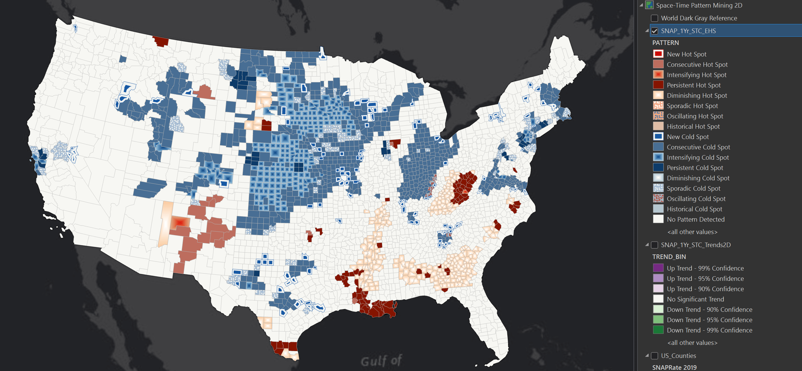
The software puts its 3D support to good use by using the 3rd dimension to explain the changes in hotspots over time.

Spotting Swimming Pools from Space
Week five saw the use of Deep Learning to detect swimming pools in Southern California. This work was also entirely UI-driven.

This task needed the Image Analyst extension which was included with the bespoke MOOC software license I used for this course.

Below are the resulting GeoTIFF files highlighting any swimming pools discovered by the model.

Story Telling
Week six was about writing stories that can include rich media, including interactive 3D maps.

The StoryMaps offering has a WYSIWYG editor where you can build interactive stories that can be shared over the web and are compatible with a wide range of devices.

The interface is very clean and minimalist.

Below is a 3D map of a Volcano in South America which was the focus of the week's material.

My Certificate
