There are two major phases of data analysis. The first is building up a basic understanding of a new dataset. Once this is done there is a second phase of understanding what's changing over time and if there are any new outliers.
For the first phase, I find Tableau to be more productive than writing code in a Jupyter Notebook. For the second phase, I like to build periotic Airflow jobs that send charts and Excel files to operational channels on Slack. These are formatted to be mobile-friendly and allow me to do more of my work on a phone rather than being chained to a laptop. This also means access is controlled via Slack rather than a custom web app.
In 2015, Jake Vanderplas started the Altair project, a library for generating charts written in 24K lines of Python. It's popular among Jupyter Notebook users and sees ~8M downloads per month between PyPI and Conda. Bokeh, Seaborn and Plotly have download counts roughly in this ballpark as well. Jake works at Google on their Colab offering, a hosted Jupyter Notebook service.
Below is a cross-highlight chart produced with Altair.
Altair is impressively documented and includes 162 examples including one diagramming the London Underground, an interactive chart with cross-highlighting and charts with geospatial data.
Altair is a Python implementation of Vega and Vega-Lite. Vega is a high-level grammar for producing charts in a declarative fashion. Ideally, a developer should be able to define what they're after in a declarative fashion rather than how to put together the end result in an imperative fashion. This can help reduce the amount of code and make an API easier to memorise.
Vega-Lite started out as a more concise dialect of Vega but since then its feature set has grown substantially. Despite this growth, Vega-Lite can still require an order-of-magnitude less code to produce the same chart.
Vega-Lite is largely the work of Dominik Moritz and Kanit Wongsuphasawat. Dominik works as a Research Scientist at Apple. Kanit used to work at Apple as well on the Swift Charts team but has since moved on to become a Senior Software Engineer and Tech Lead at Databricks.
Altair, Up & Running
I'm using a fresh install of Ubuntu 20.04 LTS with an Intel Core i5 4670K clocked at 3.4 GHz, 16 GB of DDR3 RAM and 250 GB of NVMe SSD capacity.
Below I'll install Python and some build tools used throughout this post.
$ sudo apt update
$ sudo apt install \
    exiftool \
    jq \
    python3-virtualenv
I'll set up a Python virtual environment and install a few packages.
$ virtualenv ~/.jn
$ source ~/.jn/bin/activate
$ python3 -m pip install \
    altair \
    altair_saver \
    jupyter \
    pandas \
    vega_datasets
I'll create a configuration folder for Jupyter Notebook and set a password. If you're exploring Altair's APIs then this is a great tool to see your plots as you're coding them up.
$ mkdir ~/.jupyter
$ jupyter-notebook password
The following will launch Jupyter Notebook. Note it'll run under your user's permissions and expose any files in its current directory or below to anyone that knows the password you set. I'll run the server from an empty folder as a safety precaution.
$ mkdir -p ~/empty
$ cd ~/empty
$ jupyter-notebook \
        --no-browser \
        --ip=127.0.0.1 \
        --NotebookApp.iopub_data_rate_limit=100000000
I'll open http://127.0.0.1:8888/ and type in the password I set above. I'll click the "New" button in the top right and pick "Python 3 (ipykernel)" to create a new notebook to work in.
Three Example Plots
The following is the stock price example from Altair's example gallery. It demonstrates plotting the price line of five stocks against one another on a single chart. Note how few lines of code are needed to complete this plot.
import altair as alt
from vega_datasets import data


source = data.stocks()

alt.Chart(source).mark_line().encode(
    x='date',
    y='price',
    color='symbol',
    strokeDash='symbol',
)
The dataset has three columns, ticker symbol, date and price.
source.head(5)
  symbol       date  price
0   MSFT 2000-01-01  39.81
1   MSFT 2000-02-01  36.35
2   MSFT 2000-03-01  43.22
3   MSFT 2000-04-01  28.37
4   MSFT 2000-05-01  25.45
This next chart is a scatter matrix example from Altair's example gallery. There are 3 columns that are compared with one another: Horsepower, Acceleration and Miles_per_Gallon. A further dimension describing the manufacturers' home countries is included by making it the colour of the data points in each plot.
import altair as alt
from vega_datasets import data


source = data.cars()

alt.Chart(source).mark_circle().encode(
    alt.X(alt.repeat("column"), type='quantitative'),
    alt.Y(alt.repeat("row"), type='quantitative'),
    color='Origin:N'
).properties(
    width=150,
    height=150
).repeat(
    row=['Horsepower', 'Acceleration', 'Miles_per_Gallon'],
    column=['Miles_per_Gallon', 'Acceleration', 'Horsepower']
).interactive()
Note that the above chart is interactive. You can zoom in/out and pan around the charts with your mouse.
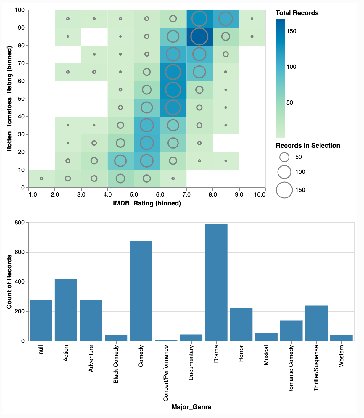
This last chart is an interactive chart with a cross-highlight example from Altair's example gallery. Clicking on any genre in the lower bar chart will filter which records are used in the plot in the upper half.
import altair as alt
from vega_datasets import data


source = data.movies.url

pts = alt.selection(type="single", encodings=['x'])

rect = alt.Chart(data.movies.url).mark_rect().encode(
    alt.X('IMDB_Rating:Q', bin=True),
    alt.Y('Rotten_Tomatoes_Rating:Q', bin=True),
    alt.Color('count()',
        scale=alt.Scale(scheme='greenblue'),
        legend=alt.Legend(title='Total Records')
    )
)

circ = rect.mark_point().encode(
    alt.ColorValue('grey'),
    alt.Size('count()',
        legend=alt.Legend(title='Records in Selection')
    )
).transform_filter(
    pts
)

bar = alt.Chart(source).mark_bar().encode(
    x='Major_Genre:N',
    y='count()',
    color=alt.condition(pts, alt.ColorValue("steelblue"), alt.ColorValue("grey"))
).properties(
    width=550,
    height=200
).add_selection(pts)

alt.vconcat(
    rect + circ,
    bar
).resolve_legend(
    color="independent",
    size="independent"
)
The above data source is a URL that Altair fetches each time this chart is constructed. Below is an example record.
$ wget 'https://cdn.jsdelivr.net/npm/vega-datasets@v1.29.0/data/movies.json'
$ cat movies.json | jq | head -n19
[
  {
    "Title": "The Land Girls",
    "US_Gross": 146083,
    "Worldwide_Gross": 146083,
    "US_DVD_Sales": null,
    "Production_Budget": 8000000,
    "Release_Date": "Jun 12 1998",
    "MPAA_Rating": "R",
    "Running_Time_min": null,
    "Distributor": "Gramercy",
    "Source": null,
    "Major_Genre": null,
    "Creative_Type": null,
    "Director": null,
    "Rotten_Tomatoes_Rating": null,
    "IMDB_Rating": 6.1,
    "IMDB_Votes": 1071
  },
Saving Altair Charts
Altair has three different engines for saving files. A built-in, Python-native engine, a Selenium-based engine and a NodeJS-based engine.
Without any additional dependencies, Altair can save to HTML and JSON. The JSON format will be in Vega-Lite format (Vega requires the NodeJS-based engine).
Below I'll put together a chart and assign it to the chart variable.
import altair as alt
from altair_saver import save
from vega_datasets import data

source = data.stocks()

chart = alt.Chart(source).mark_line().encode(
    x='date',
    y='price',
    color='symbol',
    strokeDash='symbol',
)
The following will produce a 58 KB JSON file in Vega-Lite format.
save(chart, "chart.vl.json")
The above is useful for importing your charts into the Vega Editor or the VSCode Vega Viewer. Below are the first 40 lines of the JSON file.
$ less chart.vl.json | jq | head -n40
{
  "config": {
    "view": {
      "continuousWidth": 400,
      "continuousHeight": 300
    }
  },
  "data": {
    "name": "data-96e857a61c6b623bafe23440d582a500"
  },
  "mark": "line",
  "encoding": {
    "color": {
      "field": "symbol",
      "type": "nominal"
    },
    "strokeDash": {
      "field": "symbol",
      "type": "nominal"
    },
    "x": {
      "field": "date",
      "type": "temporal"
    },
    "y": {
      "field": "price",
      "type": "quantitative"
    }
  },
  "$schema": "https://vega.github.io/schema/vega-lite/v4.17.0.json",
  "datasets": {
    "data-96e857a61c6b623bafe23440d582a500": [
      {
        "symbol": "MSFT",
        "date": "2000-01-01T00:00:00",
        "price": 39.81
      },
      {
        "symbol": "MSFT",
        "date": "2000-02-01T00:00:00",
Changing the filename extension to .html will tell Altair to produce an HTML file. The chart's data will live within the HTML file and external packages will be called from jsDelivr's Multi-CDN. This network is built on top of Cloudflare, Fastly, Bunny and Quantil. It covers every major population centre around the world including 100s of locations inside China.
save(chart, "chart.vl.html")
If you want Altair to produce a self-contained HTML file that doesn't rely on any CDN, include the inline parameter.
save(chart, "chart.html", inline=True)
If you want to produce a PNG or an SVG file then you need to use either the NodeJS or the Selenium backend. Selenium relies on either a Chromium or Gecko driver.
I'll install Selenium with the Chromium driver below. There is an outstanding issue with Selenium 4.3.0 support at the time of this writing so I'll use an older version of the library.
$ sudo apt install chromium-chromedriver
$ python3 -m pip install 'selenium<4.3.0'
The following produced a 43 KB PNG file.
save(chart, "chart.png")
$ exiftool chart.png
ExifTool Version Number         : 11.88
File Name                       : chart.png
Directory                       : .
File Size                       : 42 kB
File Modification Date/Time     : 2022:08:01 16:28:11+00:00
File Access Date/Time           : 2022:08:01 16:29:03+00:00
File Inode Change Date/Time     : 2022:08:01 16:28:11+00:00
File Permissions                : rw-rw-r--
File Type                       : PNG
File Type Extension             : png
MIME Type                       : image/png
Image Width                     : 520
Image Height                    : 347
Bit Depth                       : 8
Color Type                      : RGB with Alpha
Compression                     : Deflate/Inflate
Filter                          : Adaptive
Interlace                       : Noninterlaced
SRGB Rendering                  : Perceptual
Image Size                      : 520x347
Megapixels                      : 0.180
After running the PNG through a crusher I was able to bring it down to under 18 KB.
The following produced a 32 KB SVG file which will be more suitable for colour printing or embedding in other documents. The file GZIP-compresses down to 5.5 KB.
save(chart, "chart.svg")